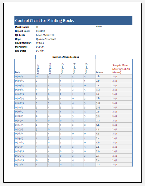
Run Chart Template
Several activities are carried out in a process to convert the input to the desired output. Different changes are often seen in the processes, and the occurrence of a change in the process is sometimes very productive. The run chart is used to determine the change that occurred and its duration.
What is a run chart?
A run chart is a graph used to display process performance over time. It can show an increase or decrease in performance quality. The upward and downward movement of the graph represents changes in trends, and the user can investigate several other details.
The run chart plots the event on the y-axis and the time on the x-axis. Various parameters are used to display in the run chart. For example, to see how quickly the patients are being treated in the hospital, the number of patients and the period each patient is treated can be plotted in the graph. Making such a run chart enables the user to see if there exists some potential for improvement.
File: Excel (.xlsx) 2007/10
Size 58 KB
A run chart monitors the conduct of a variable over time. It is used to graphically display trends, shifts, cycles, or haphazard patterns this run chart exhibits in behaviour over time. Run charts can serve two purposes.
- It identifies problems and when the problem occurred
- It screens progress when solutions are applied
- They display a pattern of data that shows deviations as you make alterations.
- They direct you toward improvement and guide you in the value of significant changes.
General Benefits
- Simple to execute
- No statistical training is required
- Displays simple data
For a run chart, the resources whose analysis has to be done are the product, service, or process. A reasonable period is the other deviator, which is calibrated with a control chart.
A dimension error indicates that the measurement process is adequate for data collection. The data is stored in chronological or consecutive order. The starting and ending point is of your choice. At least 25 samples are used to apply the procedure. Ordered pairs of x and y values are determined. The values for x characterize time or sequence number, and the values for y signify the product measurement. The Y versus X value is plotted with a standard scale. Vertical lines are plotted for the x values for separate time intervals.
What are the benefits of a run chart?
One of the most commonly used process improvement tools is run charts, which are robust, simple, and easy to use. Some of the key benefits of the run chart are:
- The run chart is a very effective tool for determining whether the process is undergoing changes in central tendency.
- To create a run chart, you don’t need to perform complex calculations or use any software. However, unlike other statistical tools, these charts don’t have several analytical techniques.
- The main focus of the run chart is on the vital changes appearing in the process. In this way, this chart traces the improvements in the process. Even if the changes do not improve the process, the run chart can tell the user about the stagnation in the progress of the process so that he can take some necessary steps.
If you find the above-mentioned procedure complex, you can switch to a free template download of a run chart with customizable tabs to draft your run chart exactly as you need it.
- Product Sales Tracker Template
- Debit Memo Template for Excel
- Winter Attire Inventory
- Financial Projections Worksheet
- Employee Absence Tracker
- Weekly Sales Report Template
- Budget Vs Actual Statement
- Remote Work Attendance Tracker
- Mileage Expense Report Template
- Fitness Calendar Template
- Project Gantt Chart
- Daily Attendance Tracker for an Individual Employee
- Overtime Hours Tracker Template
- Vacation and Leave Tracker Template
- Departmental Expense Report Template
← Previous Article
Business Statement of Account TemplateNext Article →
Vehicle Mileage Log Template